12장 인터렉티브
인터렉티브 그래프란 ?
마우스 움직임에 반응하며 실시간으로 형태가 변하는 그래프를 말합니다.
인터랙티브 그래프를 만들면 그래프를 자유롭게 조작하면서 관심 있는 부분을 자세히 살펴볼 수 있습니다.
그래프를 HTML 포맷으로 저장하면, 일반 사용자들도 웹 브라우저를 이용해 그래프를 조작할 수 있습니다.
#####################12장#############################
#### 12-1 ####
## -------------------------------------------------------------------- ##
install.packages("plotly")  # 인터랙티브만들 패키지 설치
library(plotly)

# displ(= 배기량), hwy(= 연비)
# drv(= 구동방식)별로 다른 색으로 표현하도록 col파라미터에 drv 지정
library(ggplot2)
p <- ggplot(data = mpg, aes(x = displ, y = hwy, col = drv)) + geom_point()

# 인터랙티브그래프 생성 ( 산점도 )
ggplotly(p)

p <- ggplot(data = diamonds, aes(x = cut, fill = clarity)) +
  geom_bar(position = "dodge")

ggplotly(p)
#diamonds 데이터 이용 막대그래프 생성
p <- ggplot(data = diamonds, aes(x = cut, fill = clarity)) +
  geom_bar(position = "dodge")

# 인터랙티브그래프 생성 ( 막대 )
ggplotly(p)

#### 12-2 ####

## ---------------------------------------------------------- ##
install.packages("dygraphs")

library(dygraphs)

economics <- ggplot2::economics
head(economics)

library(xts)
eco <- xts(economics$unemploy, order.by = economics$date)
head(eco)

# 그래프 생성
dygraph(eco)
# 날짜 범위 선택 기능
dygraph(eco) %>% dyRangeSelector()
# 저축률
eco_a <- xts(economics$psavert, order.by = economics$date)

# 실업자 수
eco_b <- xts(economics$unemploy/1000, order.by = economics$date)

eco2 <- cbind(eco_a, eco_b)                 # 데이터 결합
colnames(eco2) <- c("psavert", "unemploy")  # 변수명 바꾸기
head(eco2)

dygraph(eco2) %>% dyRangeSelector()

HTML로 저장하기

https://developers.google.com/chart/interactive/docs/gallery
Chart Gallery | Charts | Google Developers
Our gallery provides a variety of charts designed to address your data visualization needs. These charts are based on pure HTML5/SVG technology (adopting VML for old IE versions), so no plugins are required. All of them are interactive, and many are pannab
developers.google.com
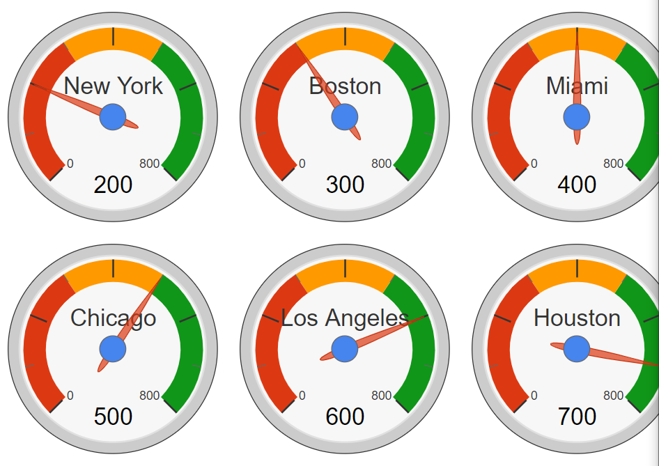
차트 생성 참고 사이트 ( 구글 차트 )
구글차트 대시보드 계기판
#구글 차트 대시보드 계기판
install.packages("googleVis")
library(googleVis)

CityPopularity

class(CityPopularity)

str(CityPopularity)

ex1 <-gvisGauge(CityPopularity, options=list(min=0, max=800,
                                             greenFrom=500, greenTo=800,
                                             yellowFrom=300, yellowTo=500,
                                             redFrom=0, redTo=300, width=800, height=600))

plot(ex1)
파이 차트
CityPopularity
class(CityPopularity)
str(CityPopularity)

pie1 <- gvisPieChart(CityPopularity,options=list(width=800, height=600))
plot(pie1)
pie2 <- gvisPieChart(CityPopularity, options=list(
  slices="{4: {offset: '0.2'}, 0: {offset: '0.3'}}",
  title="City popularity",
  pieSliceText="label",
  pieHole="0.5",width=800, height=600))
plot(pie2)

'인공지능 > R' 카테고리의 다른 글
| R - 데이터 분석 프로젝트 (0) | 2021.06.08 |
|---|---|
| R - 지도시각화 (0) | 2021.06.08 |
| R (4) (0) | 2021.06.04 |
| R 데이터 가공 (0) | 2021.06.03 |
| R 데이터프레임, 데이터 분석 기초 (0) | 2021.06.02 |

